If the long hot days of summer have you longing for a cool change of scenery, this month’s web design trends are the perfect start. While minimalism has been the “it” style of late, more designers are beginning to shift toward more details and features within the layout. The striking design patterns that we are beginning to see are a fresh alternative to the stripped-down styles we’ve gotten used to.
What do you think? Are you ready for thinner typography options, more elaborate detailing and icon-style logos? You might be after seeing some of these design projects.
Here’s what’s trending in design this month:
O1. THIN(NER) Typography
Thin type is back in! Thin typefaces got a bad rap back when Apple opted for a super thin, lightweight font for its operating system with iOS 7.
Designers balked at the option which was a little tough to read and kind of bucked many design trends happening at the time. (Flat was all the rage, but some argued that Apple’s almost flat combined with the ultra-thin typeface was too much.) At the same time, wider, bolder typefaces became the dominant element for website headline and typography on hero images above the scroll.
The tide is beginning to shift the other way. Today’s thin typefaces are somewhat thinner than what we’ve become accustomed to, but aren’t near as thin as the Apple option.
The best thing about opting for a thinner typeface is that you have a little more freedom in with the design. While thin typefaces are not recommended for body copy, they can work well at larger sizes when there is plenty of contrast.
The examples below all showcase some of the best uses of thinner typefaces:
- Use a thin typeface in all caps to create an impactful headline. This option often works best with only a few words, such as Luxury African Safaris, below. It’s equally important to think about the lettering in relationship to the actual letters; some words can be tough to read in thin typefaces or caps.
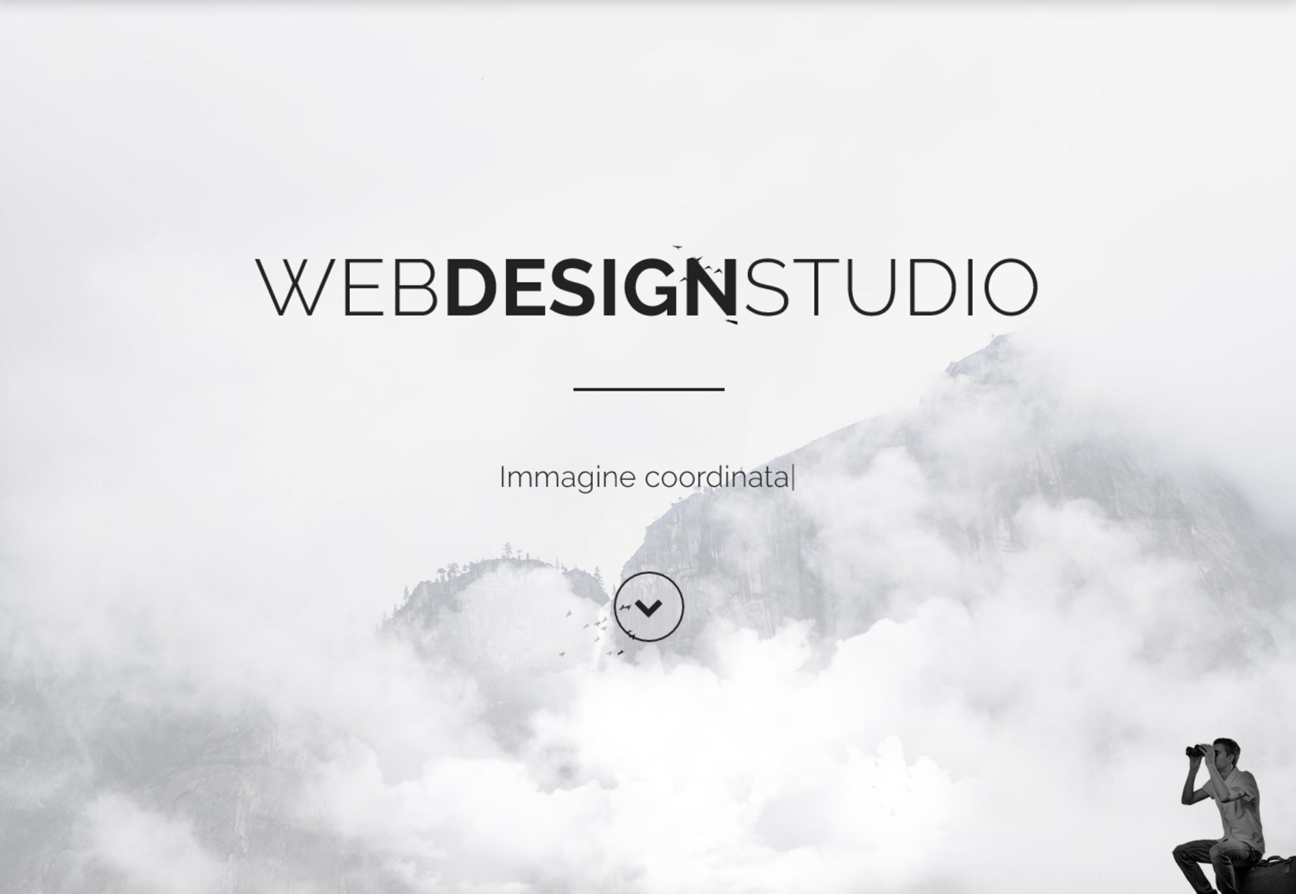
- Pair a thin typeface with a bolder option to create emphasis, such as WebDesignStudio, below.
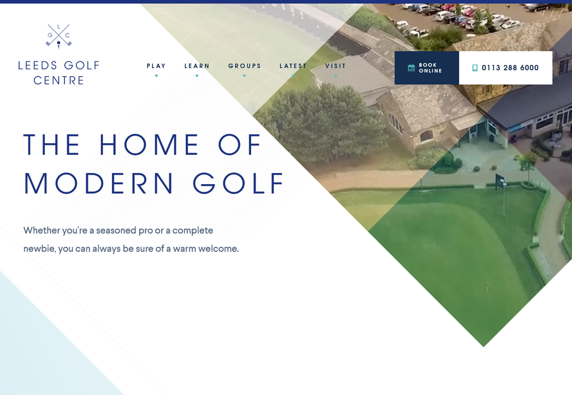
- Use a thinner typeface in color (on a contrasting background) to add visual emphasis, such as Leeds Golf Centre, below.
Looking for inspiration? Here are five Google Fonts that fit the bill (and will look great): Source Sans Pro, Dosis, Scope One, Rajdhani, Martel Sans.
O2. ELABORATE DETAILS
From fun flourishes to fancy typographic treatments to user interface elements that create unexpected delight, elaborate details are becoming more common. The trick to creating something elaborate is to make it appear as simple as possible for the user, meaning it has to be easy to understand and use.
The great thing about details is that they can add a lot of personality to a project. These elements can carry across mediums from website projects to product design to printed elements so that everything from a brand has that same special something visually. (This is an excellent way to establish brand cohesion.)
These details can appear in a number of ways and should always add to the overall effect, not detract from it. Elaborate details are best used for a single instance in the design and shouldn’t overwhelm users. Using something elaborate too many times can end up creating the opposite of the intended effect and actually visually overwhelm users. So once you find your “trick” use it once and use it well.
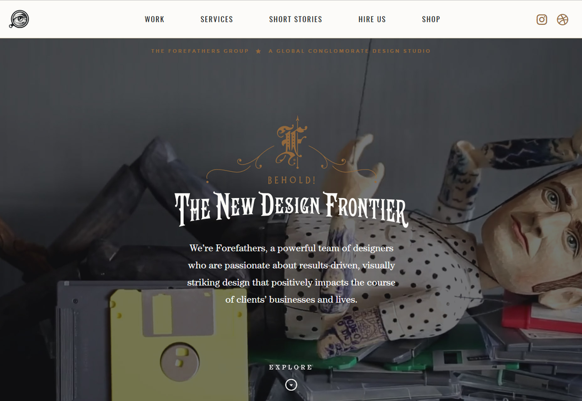
The Forefathers Group, below, uses elaborate styling with an old-style logotype with colored swashes above the headline. The type style is uncommon for web design and combined with the elaborate logotype, it is a striking combination. But you can also see how this design can only be effective with a single use. The typeface could be difficult if used for large blocks of text and the styling could get in the way of messaging. Here, the design team used it perfectly.
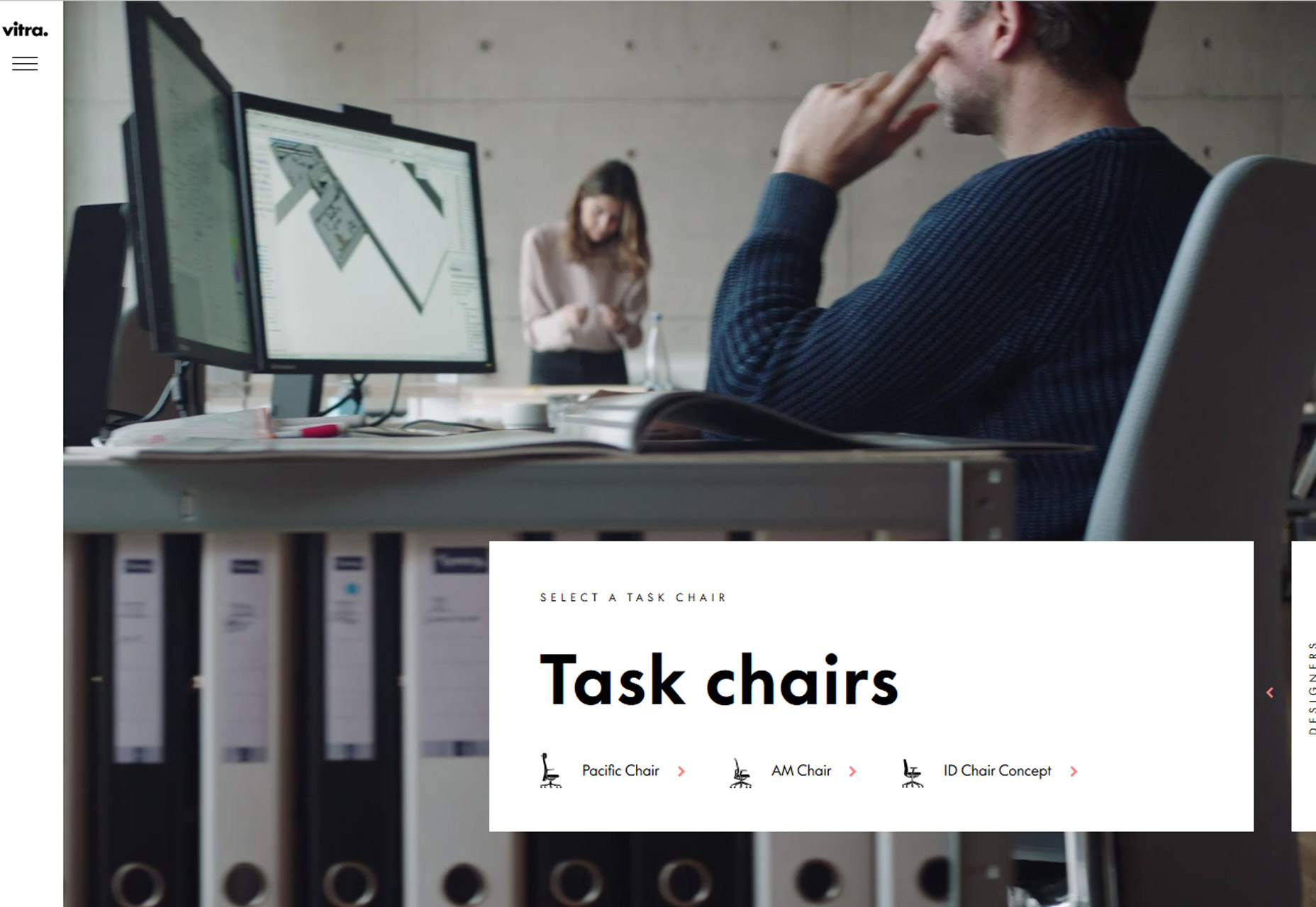
Vitra Task Chairs, below, uses elaborate user interface animations to engage users. The homepage includes a “Drag” button that opens into the product line menu. The background stays the same in both panels so that the chairs are always being highlighted in the video reel. Animations between clicks are equally interesting and even if you aren’t ready to buy a chair, moving around the website is encouraged.
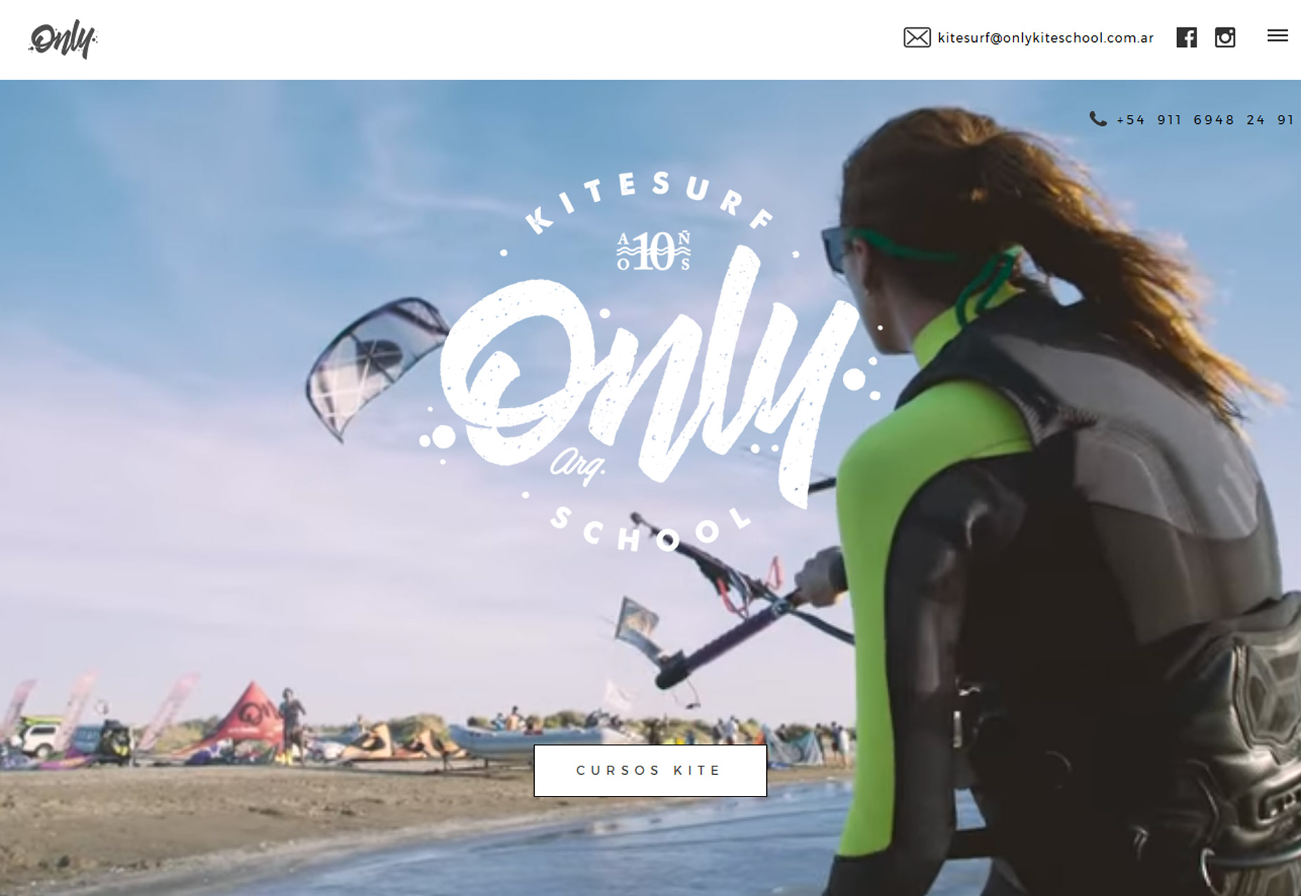
Sometimes the most elaborate design doesn’t include any super special effects. Only Kite School, below, uses fun video real and large logotype for a combination that draws the eye in. While the large logotype looks simple, creating typography that’s both readable and functional in that manner can be tough. Here, it works beautifully and the mood of the lettering matches what you would expect from this type of business.
O3. ICON LOGOS
Is that an icon or a logo? The line between the two design elements is getting more crossed all the time. Icon-style logos are popping up everywhere.
Drawn from the minimal style, and because they work in a variety of applications, icon logos can be colorful or line-art inspired. Most uses lean toward a smaller style logo in a shape that will also carry over to social media sites for consistent branding online.
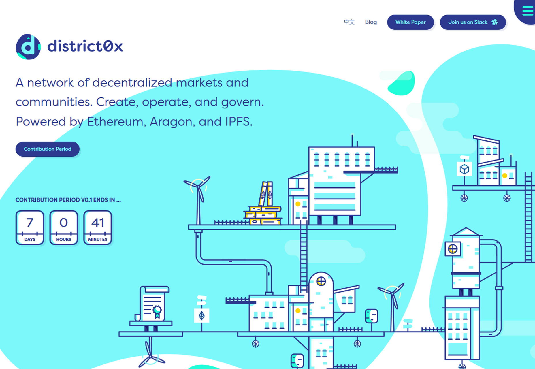
The downside of an icon logo is there’s not a lot of room for an actual company name. The best icon logos are designed so that they can stand alone or alongside lettering, such as District0x, below. Note how the colorful “d” icon could work by itself—it looks great in the circle Twitter logo format because of the asymmetrical shape—and doesn’t feel in the way when paired with the full brand name.
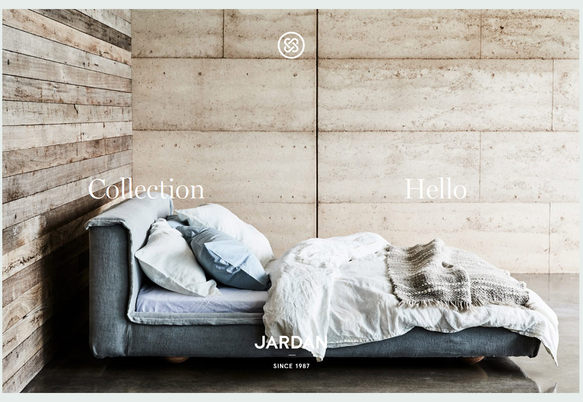
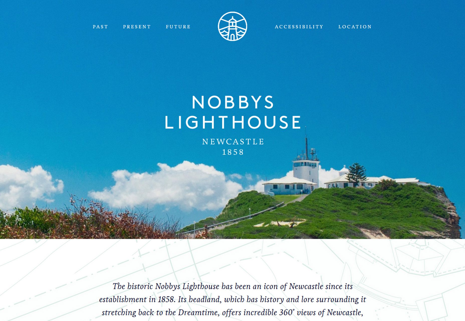
Jardan Furniture and Nobbys Lighthouse, below, opt for more simple icon logo styles with the brand name set in type below. While this is a popular option, it can create some disconnect between the name and logo. Opt for placements that connect the elements—both examples centered the logo and typeset company name—to create an eye path from one element to the next.
CONCLUSION
It’s fun to watch as trends start to shift from one dynamic to the next. Do you think more detailed styles will replace minimalism? Or is it just a passing fad?

